The Shocking Truth Behind American Horror Story’s Font: How Tea and Sam Raimi Conspired to Create the Ultimate Title Card of Terror
From Murder House to Delicate, the slightly altered ITC Willow has been the (type)face of fear – but how it it get to be that way?
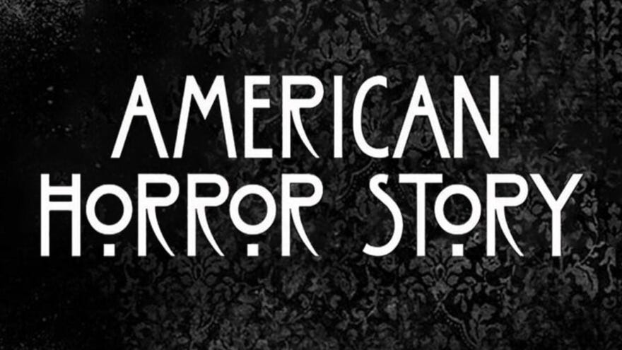 Image credit: FX
Typefaces are a funny thing – how do slight variations in lettering invoke a sense of tension, futurism, or mythology? I won’t pretend to know the answer to that, but I know that when I look at the font used by American Horror Story, I get a chill. That’s just what FX wants, of course, but it may surprise you to know that this font wasn’t always in the business of blood-curdling. Join me as I go over the history of the American Horror Story font, and I’ll tell you more.
The Willow Tea Room
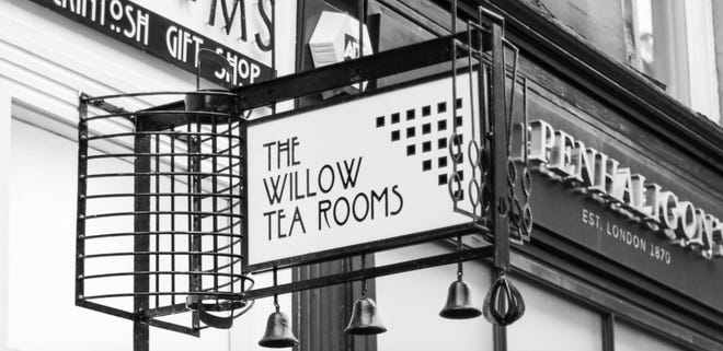 Image credit: Willow Tea Room
The font’s life began in a Glasgow teashop designed by 19th-century architect Charles Rennie Mackintosh. Mackintosh, who heavily influenced the Art Nouveau movemement, painted the signage for the tea room himself, giving birth to what was, at the time, just a classy font for a classy joint. The tea room, and its signage, still stands today.
A century after the Willow Tea Room’s construction, designer Tony Forster consolidated the sign’s letters into a font that he named, in its honor, ITC Willow. Thus was the typeface mainstreamed, but before it became AHS’s signature, it had a few stops to make in pop culture – one of which was alongside a different horror icon.
Sam Raimi & ITC Willow
 Image credit: Sony
As I mentioned, Charles Rennie Mackintosh inspired an art movement and, even now, has devotees of his work. One of those devotees is none other than Evil Dead director Sam Raimi, who discovered him while spending time at the Glasgow School of Art.
Years after his time in Glasgow, Raimi would pay homage to Machintosh and to the Willow font by including it in Spider-Man 2, as the banner for the Mary Jane Watson production of Oscar Wilde’s The Importance of Being Earnest. It’s a blink-and-you’ll-miss-it cameo, but the inclusion is a cool nod from one great artist to another, not to mention a kind of “before they were famous” looks at what would become one of the most widely-seen typefaces on modern TV.
FX & American Horror Story
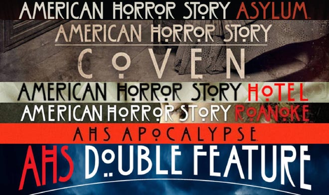 Image credit: FX
And now we come to it – the beginning of a beautiful aesthetic partnership and Willow’s big Hollywood break. Well, let me qualify that – the font that FX purchased for American Horror Story is actually a slightly modified version of ITC Willow.
(One noticable difference, to this writer’s mind, is that FX used the ‘R’s to their original Mackintosh design – described as “creepy” and “sickle-like” by Shawn Bailey at Inquisitor – as opposed to the more common straight-legged ‘R’s of the ITC willow font.)
Since the show’s beginning, the Willow font has been the logo for every season of American Horror Story and, when the time came for a spinoff, the logo for each season of American Horror Stories as well. Only AHS season 9, titled 1984, featured an altered lettering scheme (to match the woodsy “summer camp” theme of the season), but the base of the scratchier letters still came from that Glasgow tea shop.
If I’m being honest, I doubt that either Charles Rennie Mackintosh, Tony Forster, or Sam Raimi meant for Willow to become such a celebrity in the horror world, but that’s the thing about horror, and typefaces too: despite their origins, some things exist with an inherintly chilling nature…
And us not knowing why only makes them more frightening.