Explore the latest controversy surrounding Assassin’s Creed Shadows as a potential menu UI leak sparks debate among fans.
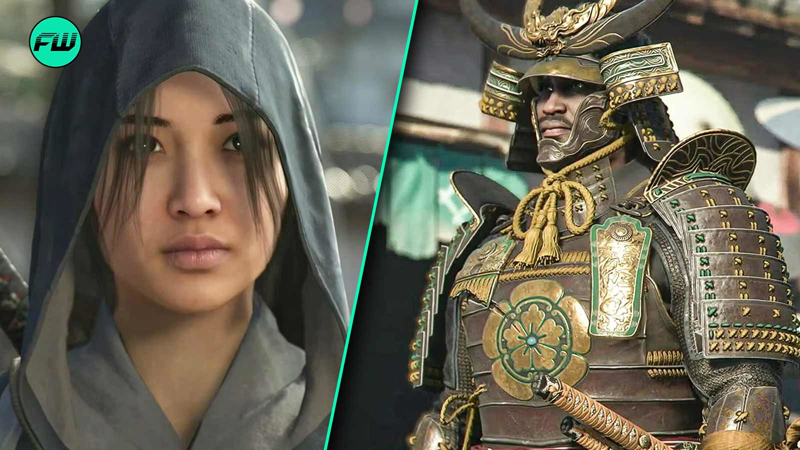
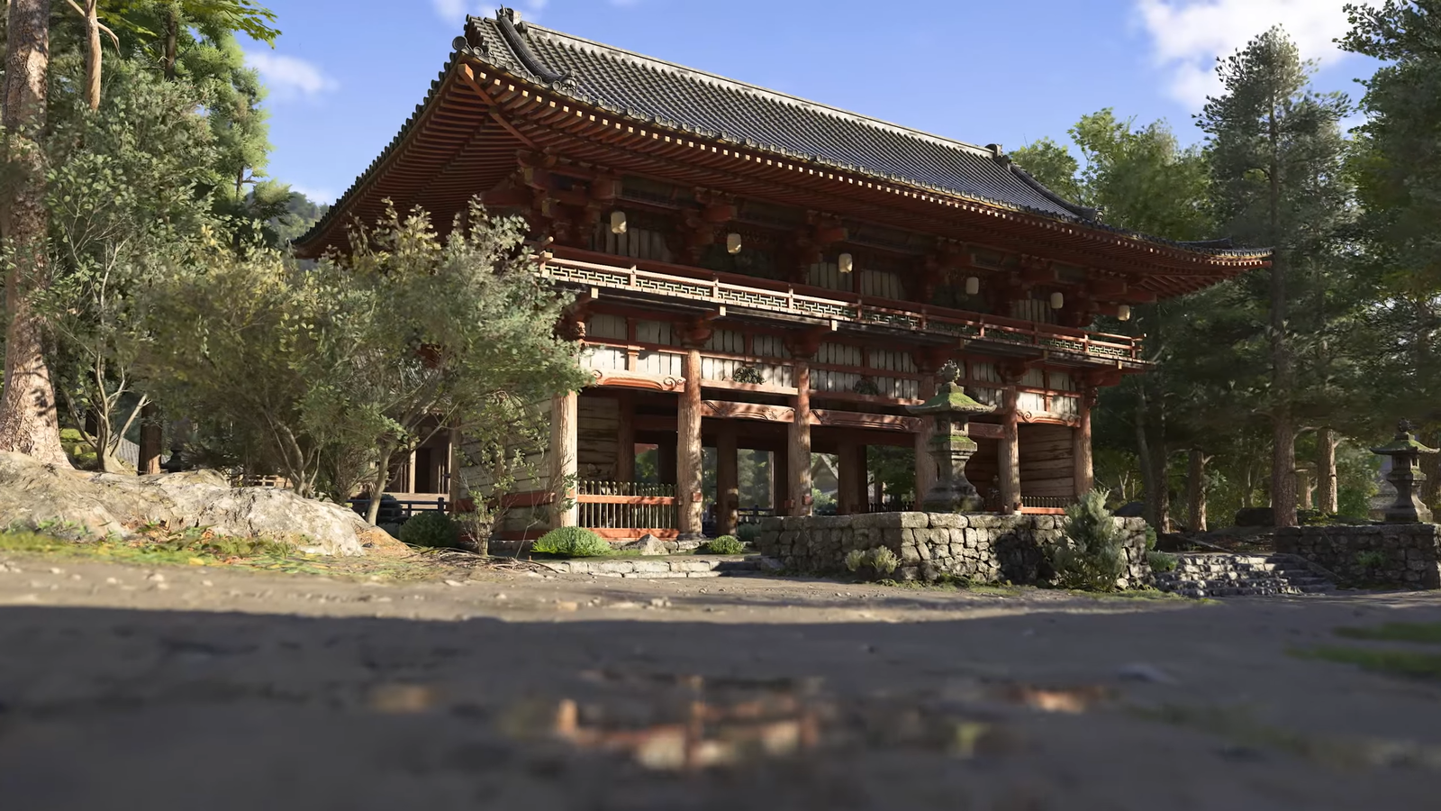
In the gaming industry, there are only a few titles that are as popular as Assassin’s Creed and with its new title, Assassin’s Creed Shadows, coming soon, players are excited to see what’s in store for them this time. The game promises an exciting new adventure that is set in the 16th-century Japan.
The game is set to release on 15th November and features 2 protagonists, Naoe and Yasuke. However, various conspiracies are making the game’s appeal smaller and smaller. The recent rumors showcasing the messy UI of the game, making players even more discouraged.
Assassin’s Creed Shadows Possible Menu Leak Making Fans Unhappy
Ever since the announcement of the new Assassin’s Creed Shadows, players have been speculating various aspects of the gameplay and new mechanics the game will introduce in the franchise. However, as the details about the game have been released more controversies are emerging than any positive discussions among the community.
Players were excited to see the movement of Naoe as she was a shinobi assassin. However, when her movements were showcased, players felt that her movements were very stiff and lacked emotions. Now that a possible leak for the game’s menu has surfaced, players are even more discontent as for many it lacks creativity.
Reddit User, AssassinsHome4, posted a clip showcasing the menu UI and the background. After seeing the clip, players have mixed feelings as some feel this must be fake (because too bad) or not rendered properly (missing some color), while others are not happy at all, hoping that this is the final product as this much red hurt their eyes.
Some players feel that the red is a tad bit too much and needs some contrast.
While others can’t see this menu for too long as it hurts their eyes.
Some find the menu UI too similar to the previous game but with a red background.
Some also feel the cursor should be different for each platform. The thread is full of comments that highlight the glaring issues with the menu UI and how it is similar to other titles in the series. Even tho players loved the background image, the red color all around is dropping the appeal (needs more contrasting color).
Ubisoft Needs to Address These Issues Before the Release
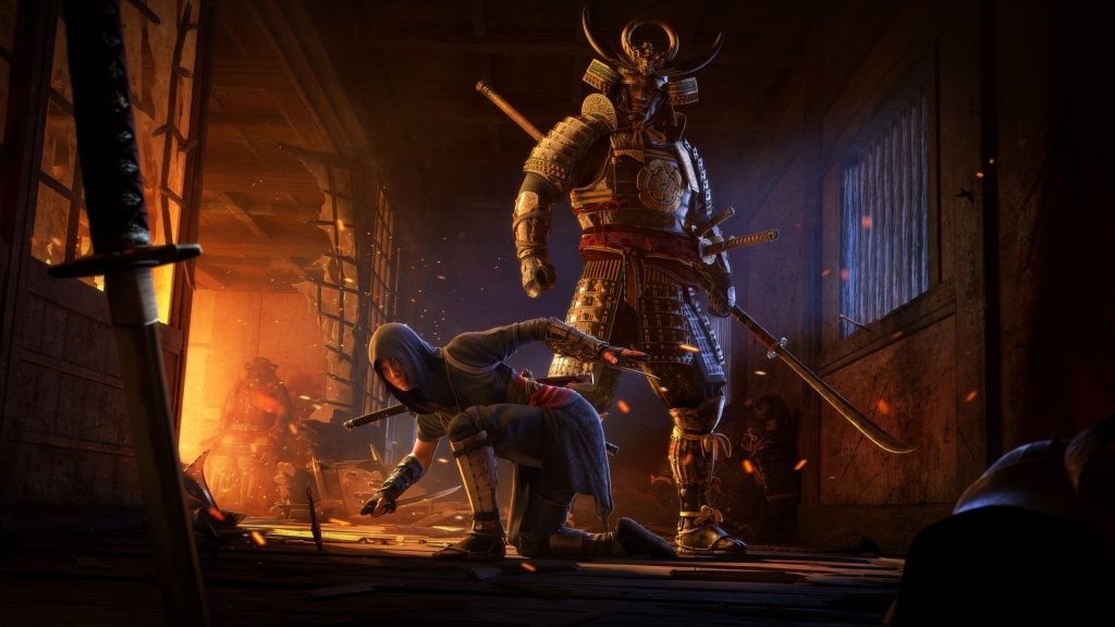 Players are not happy about the possible menu UI for the upcoming game. | Image Credit: Ubisoft
Even though Assassin’s Creed Shadows has gotten a lot of hate for its various choices (protagonist, now Menu UI). If the game is able to deliver immersive and engaging gameplay, all the players (new or old) will forget these controversies and enjoy it to the fullest.
However, to achieve that feat, Ubisoft needs to step up and show more commitment to the game. Rather than following its set path, it needs to listen to the player’s feedback and address these issues as quickly as possible. By doing this it will not only achieve more faith from the fans but will also distract players from all the controversies.
As the players are digging into rumors and leaks to learn more about the game, now is the time for the studio to prove that they listen and are dedicated to making the gameplay experience as immersive as possible. In the end, players can only hope and raise concerns over the issues, it is in the hands of the developer to actually implement the changes.
Do you like the possible Menu UI for the upcoming game? Tell us in the comment section below.
News
Elder Scrolls IV: Oblivion Remastered Players Discover Simple Setting Change That Instantly Boosts Performance—Find Out What’s Got Everyone Buzzing Below!
Elder Scrolls IV: Oblivion Remastered Players Discover Simple Setting Change That Instantly Boosts Performance—Find Out What’s Got Everyone Buzzing Below! The recent release of The Elder Scrolls IV: Oblivion Remastered has captivated both longtime fans and newcomers with its stunning…
STAR WARS: BATTLE OF HOTH UNVEILED: Days of Wonder’s Epic Board Game Brings Hoth’s Iconic Clash to Your Tabletop! Command Rebels or Imperials in a Fast-Paced Strategy Showdown That’s Got Fans Buzzing—Discover Why This Game Is a Must-Have! ❄️
Star Wars: Battle of Hoth Board Game Unleashes Epic Tabletop Warfare in a Galaxy Far, Far Away In the vast universe of Star Wars, few moments are as iconic as the Battle of Hoth from The Empire Strikes Back. The…
CYBERPUNK 2077 FANS, CLEAR YOUR CALENDARS FOR JULY 17: CD Projekt Red’s Mysterious Reveal Promises a Game-Changing Night City Update! A Highly Anticipated Event Sparks Feverish Hype and Speculation—Discover Why This Date Has the Gaming World Electrified! 🌃
Cyberpunk 2077’s July 17 Reveal: A Night City Bombshell That Has Fans Buzzing In the neon-lit world of Cyberpunk 2077, where corporate intrigue and cybernetic chaos reign, CD Projekt Red has mastered the art of keeping fans on edge. Since…
ELDER SCROLLS: OBLIVION REMASTERED’S SHOCKING SECRET: Hidden Door Warps Players to Game’s Epic Finale! Bethesda’s Revamped RPG Unveils a Mysterious Shortcut That’s Got Fans Buzzing with Excitement and Debate—Uncover Why This Discovery Is Taking Tamriel by Storm! 🚪
Elder Scrolls: Oblivion Remastered’s Secret Door: A Shortcut to the Finale That’s Stunning Fans In the storied legacy of The Elder Scrolls, few games hold the nostalgic weight of The Elder Scrolls IV: Oblivion. Released in 2006, its vibrant world…
SKYRIM REBORN IN UNREAL ENGINE 5: Bethesda’s Official Remake of a Fantasy Epic Stuns Fans with Next-Gen Glory! Tamriel’s Legendary World Revamped with Jaw-Dropping Visuals Ignites a Frenzy of Hype—Dive into Why This Remaster Has Gamers Spellbound! 🐉
Skyrim’s Unreal Engine 5 Remake: A Legendary RPG Reborn in Next-Gen Splendor In the annals of gaming history, few titles have left as indelible a mark as The Elder Scrolls V: Skyrim. Since its 2011 release, Bethesda’s open-world masterpiece has…
DARK SOULS 4 TAKES A BACKSEAT: New RPG Blending Skyrim’s Epic Scope with Bloodborne’s Brutal Horror Steals the Spotlight! A Groundbreaking Fusion of Open-World Adventure and Gothic Terror Has Fans Buzzing with Hype—Discover Why This Game Is the Talk of the Gaming World! 🎮
What a combo this headline is – Dark Souls, Bloodborne, Skyrim, all absolute bangers that, if merged together, could make for a hell of a game, right? I feel like we’re setting you up for something special, but this is all pulled…
End of content
No more pages to load
